| Child pages (Children Display) | ||||
|---|---|---|---|---|
|
Design Surface
The Design Surface displays a report that is being edited in the Report Designer.
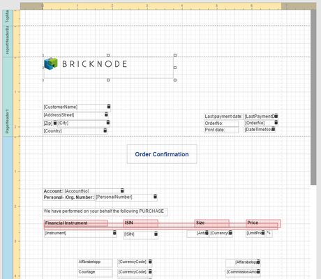
A report is built from controls (text labels, images, zip codes, charts, etc.) spread across report sections called bands (various headers, footers and content sections). The main interface report elements helping you manage these building blocks are:
Anchor Rulers Rulers
Rulers
| Rulers | |
| Rulers |
The horizontal and vertical rulers display tickmarks in the measure units specified for your report. Click an element to evaluate its size and location using the rulers.
The horizontal ruler also allows you to modify report side margins by moving the left and right sliders on the ruler.

The vertical ruler shows resizing rectangles for every report band, which you can move to change the band height.

A Report Band represents a specific area on a report page, where report controls are contained. A band is used to define how to render report controls that belong to it. In the Report Designer, every report consists of a number of bands, each of a different type.
To add a new band to a report, select the report or any of its bands in the Properties panel and click an appropriate item in the Actions category.

The following table lists the band types:
| The Top Margin band represents the top page margin. It is intended for displaying page numbers, or some sort of supplementary information (e.g. current system time or the user name). |
| The Report Header is located at the beginning of a report. This band is intended to display some introductory information, e.g., a cover page for a report (the report's name, company logo, date of creation and user name, etc.) |
| The Page Header band is located at the top of every page, below the Top Margin or Report Header band. This band is intended to display page numbers or a table header, continued from the previous page. |
| The Group Header band is located at the beginning of every group or at the top of the page if it is split across pages. This band specifies grouping criteria and is used to display information at the beginning of a group of records. |
| The Detail band is located on a page between all other bands. This band cannot be deleted - the present report structure includes the Detail band in its core. In a data-bound report, the contents of the Detail band are repeated for every data entry. And, if static data is also present in the Detail band, it is repeated with each new entry in the resulting report. For more information about data binding, refer to Providing Data. |
| The Group Footer band is located at the end of every group or at the bottom of the page if this group is split across pages. This band is primarily intended to show summary information for a group. |
| The Report Footer finalizes the informative part of the report. It is placed before the Page Footer and Bottom Margin on the report's last page. This band is intended to display some final information, e.g., report totals. |
| The Page Footer band is located at the bottom of every page, below the Report Footer and above the Bottom Margin band. This band is intended to display page numbers or a table footer, which is continued on the following page. |
| The Bottom Margin band represents the bottom page margin. It is intended for displaying page numbers, or some sort of supplementary information. |
| The Sub-Band provides a functional copy of the source band below which it is located. A sub-band's behavior, as well as its position within the report band hierarchy, is dictated by the source band type. Any number of sub-bands can be added to the report band of any type, except for the Top Margin and Bottom Margin bands and the sub-band itself. |


Anchor maintoolbar maintoolbar
Main Toolbar
| maintoolbar | |
| maintoolbar |
The Main Toolbar provides quick access to the report editing commands.

Clipboard Commands
Use these commands to place the selected elements to the clipboard and paste them onto the required report bands.
Command | Icon | Description |
|---|---|---|
Cut |
| Cuts the selected control to the clipboard. |
Copy |
| Copies the selected control to the clipboard. |
Paste |
| Pastes a control from the clipboard to the selected report band. |


Edit Commands
Use the following commands to delete report elements and cancel previous actions.
Command | Icon | Description |
|---|---|---|
Undo |
| Cancels the last change made to the document. |
Redo |
| Reverses the results of the last undo action. |
Delete |
| Deletes the selected control. |


View Commands
Use the following commands to adjust the report zoom factor.
Command | Icon | Description |
|---|---|---|
Zoom In |
| Increases a document's current zoom factor by 1 percent. |
Zoom Out |
| Decreases a document's current zoom factor by 1 percent. |
Zoom Factor |
| Zooms to a specific zoom factor selected from the dropdown list. |


Mode Commands
Use the following command to toggle between the Design and Preview mode of a report.
Command | Icon | Description |
|---|---|---|
Preview |
| Displays the current report. |

Anchor toolbox toolbox
Toolbox
| toolbox | |
| toolbox |
The Toolbox contains elements (report controls) that can be added to a report. Different controls correspond to various kinds of data that can be displayed in a report.
To add a new control to the report, drag the corresponding item from the Toolbox and drop it onto the required report band.
The following controls are most commonly used to display data in this kind of report, subscriptions or order confirmations.
| The most basic Label control is intended to display text in your report. It can represent static or dynamic text or both. The Label's text can only be formatted as a whole. So if you need to differently format different parts of text, use the Rich Text control. |
| The Rich Text control allows you to display formatted text in your report. It can represent static or dynamic text or both. You can load content to the Rich Text from an external TXT or RTF file (which can also contain images) and then format any part of it. |
| The Picture Box control is intended to display images of numerous formats in a report. An image can be loaded from an external file, from a bound data source, or from a web location using the specified URL. |
| The Line control draws a line of a specified direction, style, width and color. It can be used for both decoration and visual separation of report sections. The Line cannot cross report bands, as opposed to the Cross-band Line control. |
| The Panel control is a container that frames separate report controls to allow them to be easily moved, copied and pasted, and visually unite them in the report's preview (with borders or a uniform color background). |
| The Table control is designed to arrange information in a tabular layout. It may contain any number of rows comprised of individual cells. Both rows and cells can be selected and customized individually. In most aspects, a cell is similar to a Label, but can also contain other controls (e.g., Picture Box or Rich Text). |


To add a control to the currently opened report, drag and drop it onto an appropriate report band.

Anchor Menu Menu
Menu
| Menu | |
| Menu |
The Report Designer menu is invoked by clicking the menu button in the upper-left corner of the designer's user interface.
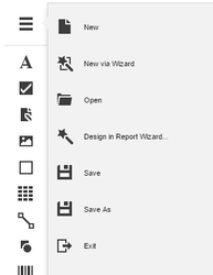
The menu contains the following commands. Save  is the command that will mostly be used in this kind of report, when editing the report.
Command | Icon | Description |
|---|---|---|
New |
| Creates a report and opens it in a new tab. |
New via Wizard |
| Invokes the Report Wizard to create a new report and generate the report layout. |
Open |
| Invokes the Open Report dialog to retrieve a report from the server-sider report storage and open it in a new tab. |
Design in Report Wizard |
| Invokes the Report Wizard to edit the current report and generate the report layout. |
Save |
| Saves the current report to the report storage. |
Save As |
| Invokes the Save Report dialog to save the current report to the report storage under a new URL. |
Exit |
| Closes the Web Report Designer. |


To switch to this panel, click the Properties button marked with the 'gear'  icon.
icon.
To show/hide the Properties panel, click the Collapse/Expand stripe at its top.

The Report Controls drop-down list at the top of this panel allows you to instantly select a report element and access its properties.

Set a Property Value
To set a property value, expand the corresponding category by clicking its header, and specify the necessary value using the property editor.

Complex Property Values
A complex property can exhibit other properties within it. To access these nested properties, click the corresponding complex property header to expand it in the Properties panel.

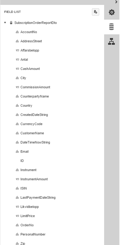
To switch to this panel, click the Fields  button.